
Why are they green?
Medieval painting techniques show complete mastery of colour theory

If you’ve ever looked closely at a medieval painting and thought the faces looked strangely green, you’re not imagining it.
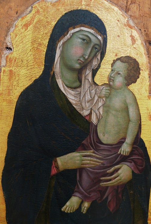
Stand in front of a painting by the famous medieval masters like Duccio di Buoninsegna, and you’ll often notice an olive-green cast in the shadows of the face. In some cases, this greenish look is the most obvious feature. It can look surprising to modern eyes. Were medieval painters simply bad at painting skin tones?
In fact, what looks at first like an odd medieval quirk is actually evidence of an extraordinarily sophisticated understanding of colour and human vision. But once you understand the unique medieval combination of egg tempera, translucent pigments and the optical physics of colour, the mystery clears.

We’re going to look in today’s post for all subscribers at some paintings by the Sienese Gothic master Ugolino di Nerio, to look very closely at how these paintings were constructed, with multiple layers of translucent egg tempera paint - a very different set of techniques from later oil painting. We’ll see how the techniques were used to create lifelike skin tones, and how these faded back to green over the centuries.
Below the fold at the bottom, paid members of the Sacred Images Project will find a few little discounts from the shop, The Gilded Corner Market, on selected items that I hope you will find both useful and beautiful.
New here? Start here.
The Sacred Images Project is a growing reference library dedicated to the history, theology and practice of Christian sacred art. Through essays, guided Reading Rooms, videos and other resources, we aim to recover the visual language that shaped Christian civilisation for more than a thousand years and make it accessible to artists, students and anyone who wants to understand it.
If you’ve only just discovered the project through Google, a recommendation, or a shared article, click the Start Here button below to get the big picture and find the best place to begin.
The Reading Rooms are open - Foundations
One of the biggest projects we’ve undertaken this year is reorganising the Sacred Images Project archive into subject-based Reading Rooms. Instead of disappearing into a chronological archive of more than 300 essays, articles are being grouped and cross-linked by topic, so each Reading Room becomes a complete guide to a particular subject.
If you’re new to the subject, the Foundations Reading Room brings together the essential articles that explain what sacred art is and why it’s more important than you’ve probably been told; why Christians make images, and how this visual language developed.
From Foundations more doors will take you deeper.
Become a member
The Sacred Images Project is becoming a permanent reference library for the history, theology and practice of sacred art.
Free subscribers receive regular public essays, news and updates.
Members receive:
Weekly subscriber-only essays and in-depth series.
Full access to the Reading Rooms as they continue to expand.
Downloadable resources, high-resolution images, shop discounts and other member extras.
Members’ discussions in the dedicated Chat, additional printable materials and videos as they are released.
Membership in the Ars Sacra Association and all future members’ benefits on the new website (in development).
Free – Public articles and updates and Notes on the Substack platform.
Annual Member – US$75/year – Full access to all member benefits.
Patron – US$125/year – For those who wish to provide additional support for the work.
If you’d prefer to set up a monthly donation in an amount of your choice, or make a one-off donation to the work, you can do that at the studio blog here:
If you set up a recurring monthly donation above $9/month, I will manually add you to the complimentary subscription list here for a year, which means you’ll have all the benefits of a paid subscription.
I hope you’ll join us.
Colour theory - temperature
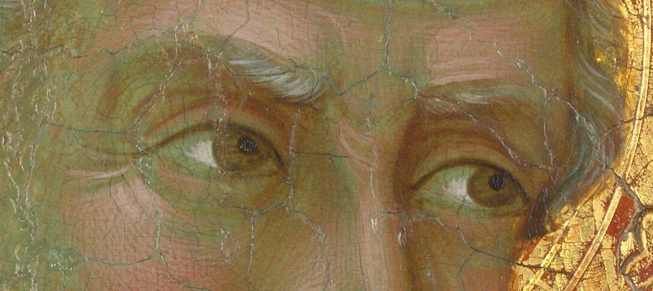


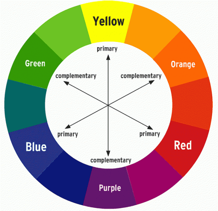
Painters see things with a precision most untrained observers can’t match. They know that though it’s true that human skin tones are, seen from a distance, all some variant on “tan,” none is simply pink, brown or beige. Look carefully at a real face in strong daylight and you’ll find bluish and greenish tones hiding in layers in the shadows, with warmer reds and golden ochres where the light strikes. Medieval painters understood this remarkably well and used the painterly principle “cools recede and warms come forward” in their modelling of faces and hands.
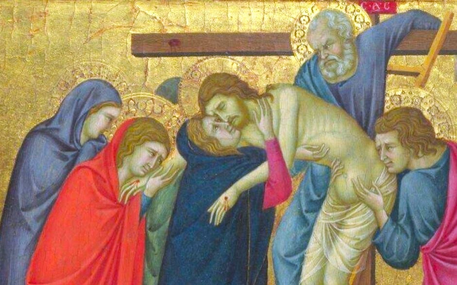
An important aspect of technical colour theory is “colour temperature”: the colour wheel is divided into warm (reds → oranges → yellows →) or cool (purple → blue→ green → ).
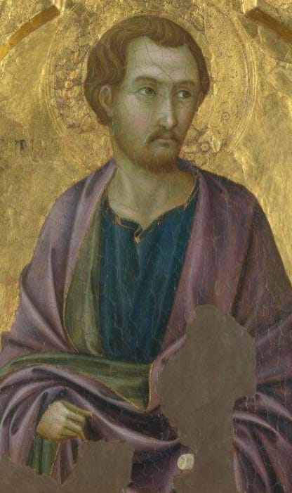
Shadows and highlights are not only created using dark and lighter values of paint. Our eye naturally perceives warm colours as tending to come forward, while cool colours seem to recede in space. This means it’s essential to understand the power of colour temperature to create the illusion of three-dimensional forms.
The secret lies underneath: verdaccio
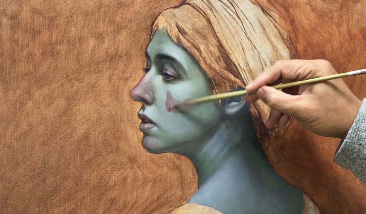
The first thing to understand is that medieval painters using egg tempera medium did not begin by mixing flesh tone colours on a palette and just adding them in directly as is done with most oil painting technique. While oil paints are opaque, egg tempera medium creates a translucent finish, so the eye blends the colours of the different layers together, much as it does when looking at real human skin.
Around 1400, the Florentine painter Cennino Cennini described the technique in his famous workshop manual, Il Libro dell'Arte1, recommending verdaccio as the proper foundation for painting flesh in egg tempera.
The technique the Sienese painters used, called verdaccio, developed from the older Byzantine method known as proplasmos2, the olive-green foundation upon which icon painters built their flesh tones. As Byzantine artistic traditions spread into Italy, medieval painters adapted the technique, but the principle remained the same: begin with cool shadows, then gradually bring the facial features into the light.
A complete “cartoon” or fully rendered value drawing was needed before any paint was applied to a panel. The shadows of cheek hollows and eye sockets, beneath the nose or lower lip were all perfectly mapped first. The drawing is transferred to the painting surface3, and then the entire surface is covered in a flat undercoat of cool green or olive-grey underpainting.
The forms of the face were then built up gradually in countless fine layers of colour, a stroke at a time, from darker to lighter tones to create highlights on forms - nose, chin, forehead, cheekbones, etc. Unlike oil paint, which can be blended wet into wet on the painting surface, each stroke in egg tempera dries almost instantly, so “shading” and colour changes are built up with thousands of tiny hatchmarks, each depositing a thin veil of colour over the previous layer. These translucent layers of yellow ochre, red and white are laid on top of the verdaccio, allowing just enough of the cool underpainting to remain visible in the shadows.
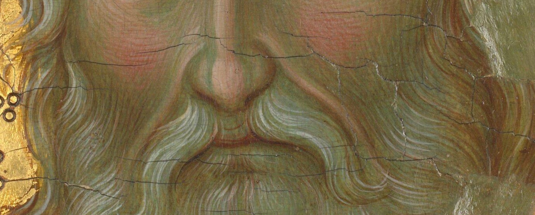
Seen close up, these look simply like separate strokes of green, red, ochre and white.
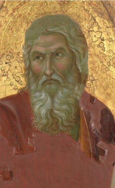
But stand back a few metres and your eye performs the final act of the illusion, optically blending those countless marks into luminous flesh that seems almost to glow from within. Rather than hiding the verdaccio, the painter relies on it remaining slightly visible to the eye, though mostly unconsciously. The cool underpainting remains an active part of the finished image, giving depth to the shadows while the warm highlights seem to emerge naturally into the light.
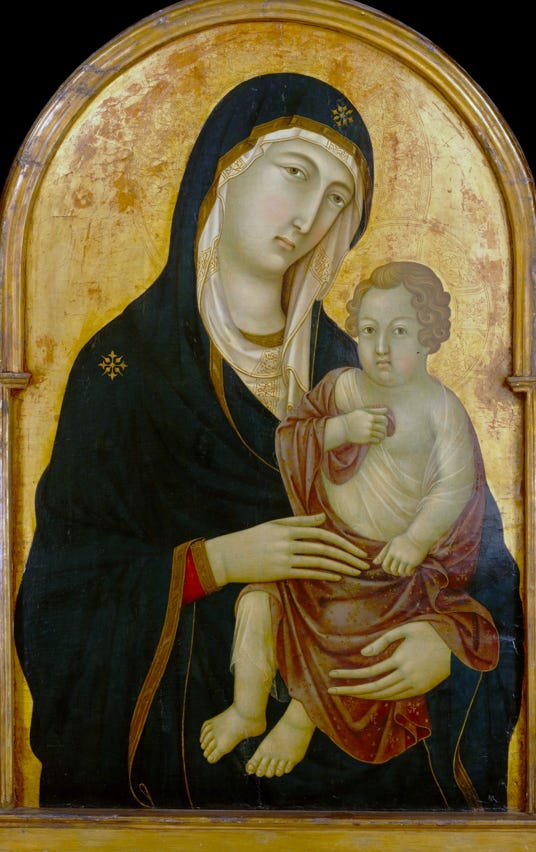


Done well, the result can be astonishingly lifelike.
Why do we see the green? - for one thing, it’s 700 years later
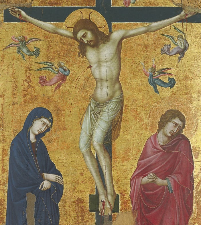
There’s another reason we notice the green more today than medieval viewers would have. Over the centuries the delicate upper layers of egg tempera have often become thinner through age, cleaning and wear. While egg tempera medium is very enduring, the pigments are still afected by time. Some red and yellow pigments fade or change chemically as a reaction to oxygen, and microscopic particles of paint may simply have been lost. As those warm surface colours become less opaque, the verdaccio beneath becomes increasingly visible, giving many surviving paintings their distinctive greenish cast.
Verdaccio technique is still in use
In fact, verdaccio is still taught today because of how well it works to render lifelike and nuanced skin tones. Contemporary portrait painters using oils, acrylics, pastels or coloured pencils often begin with exactly the same principle: establish the cool structure first, then build warm flesh over it. The eye - or more accurately, the visual part of your mind - blends the layers into convincing, luminous skin that would be difficult to achieve by painting flesh colours directly.
End note for paid members
I’m so pleased to have found this really nice high resolution image of this Ugolino painting held by the Metropolitan Museum that I turned into a PDF which you can download for free below.
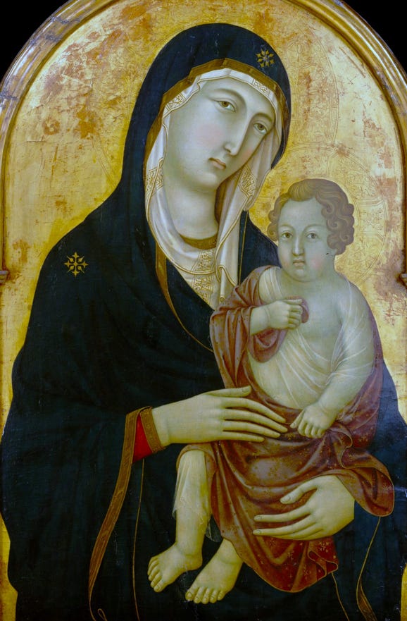
This painting is so gorgeous, I couldn’t resist turning it into something we can all take home and carry around.
Here’s our new Ugolino Madonna and Child notebook for the Gilded Corner Market shop:
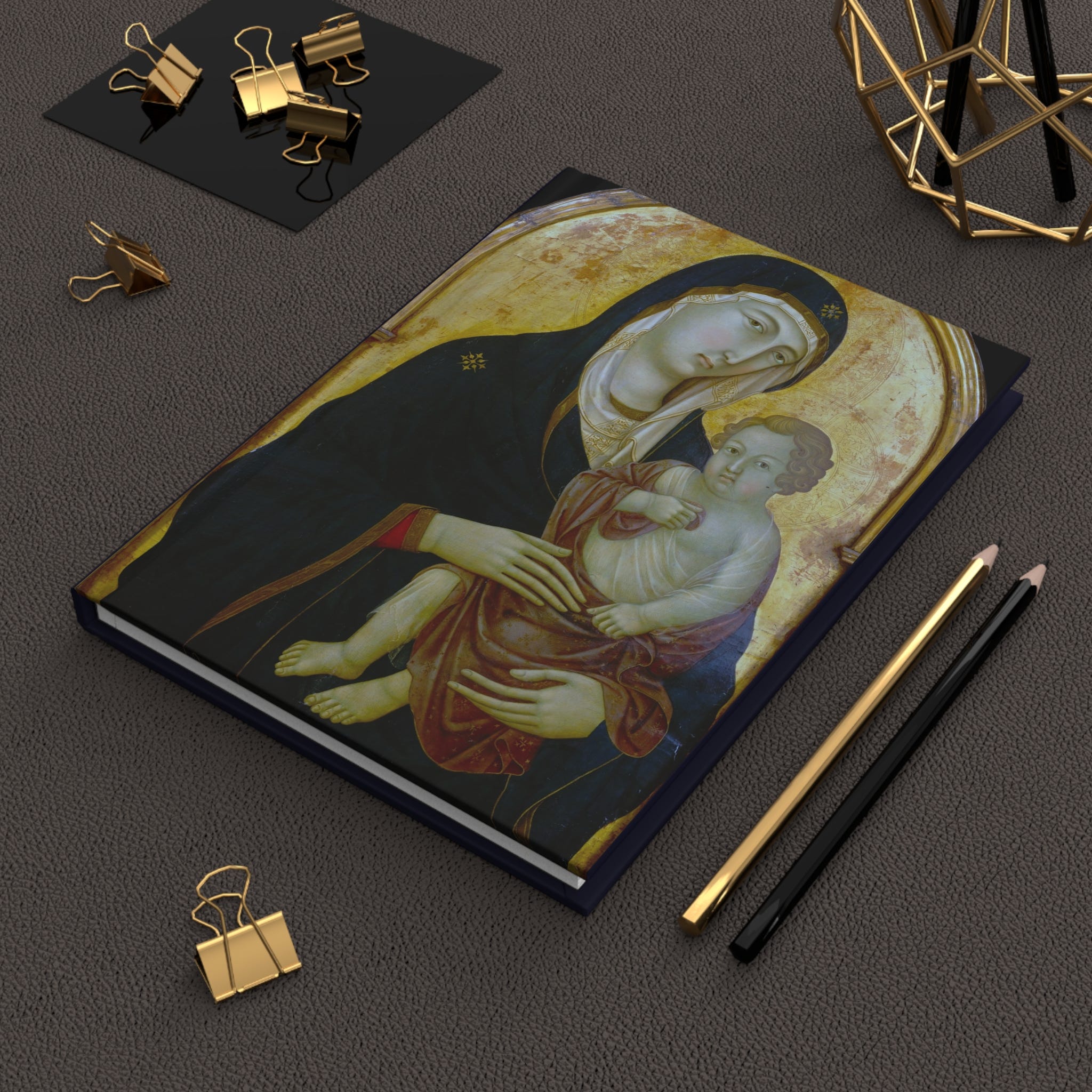
Paid members can pick up their shop discount coupons below for 20% off.