Friday Goodie Bag, June 21: how to tell Gothic from Romanesque and some contemporary sacred artists
Below the fold: Pics and videos from the blessing of the new monastery in Norcia and some more good monastic news
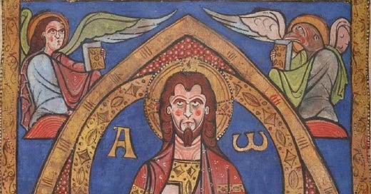
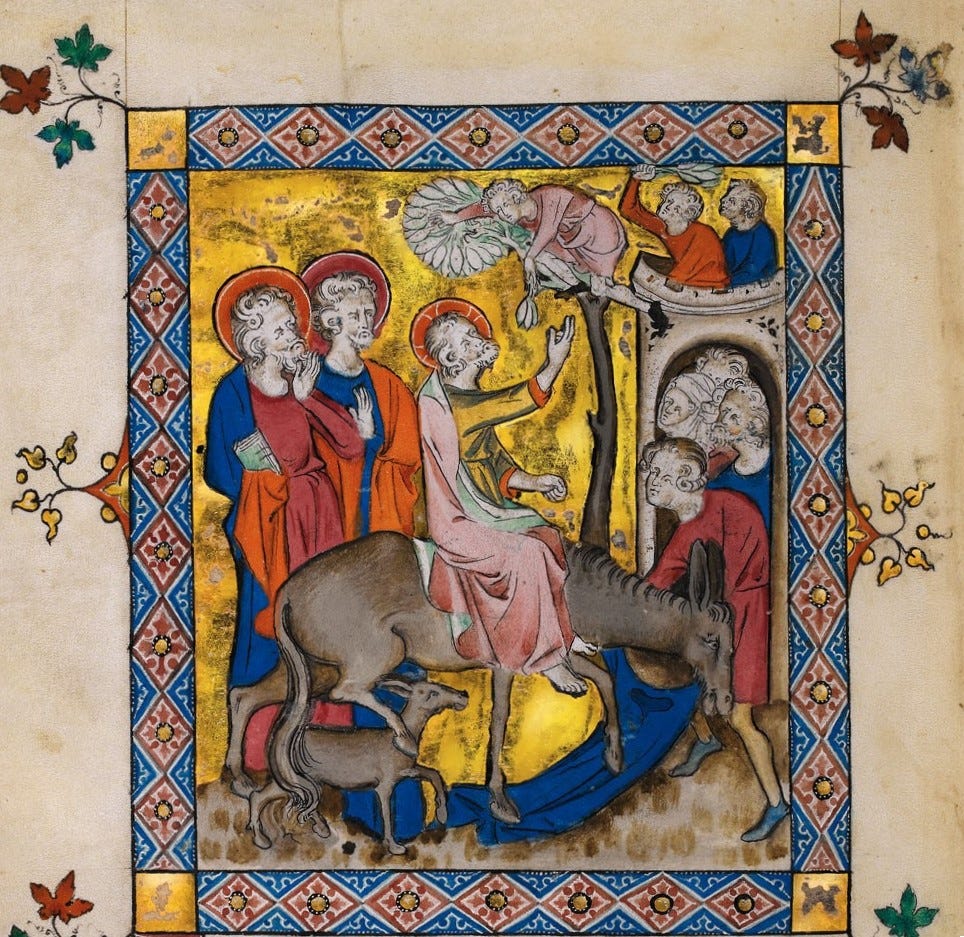
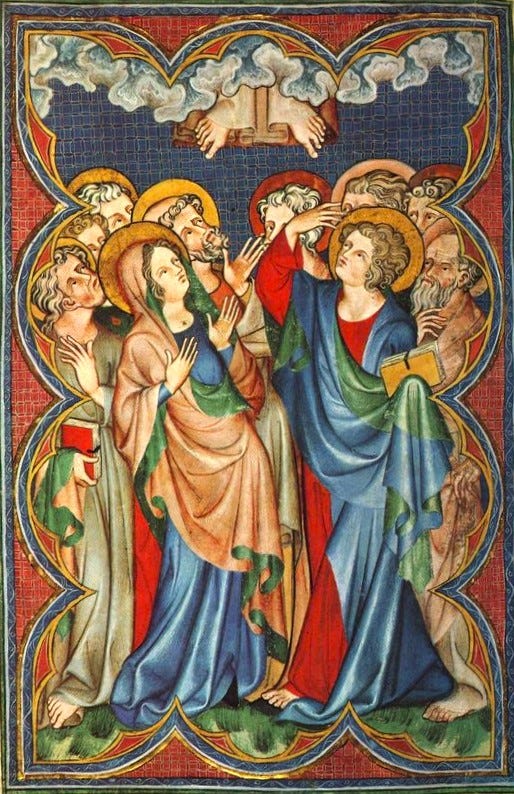
Last week everyone did very well on our “Romanesque or Gothic” quiz. Let’s take a quick look at the answers and discuss how to tell the difference at a glance, (though it sure seems like most of you have really got a pretty solid handle on it.)

~
~

~
~

~

Well done!
Further reading from our old friend Gregory DiPippo on the fantastic early 12th century Missal of Limoges at New Liturgical Movement.
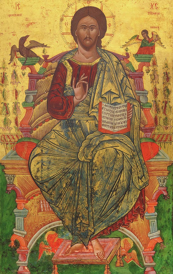
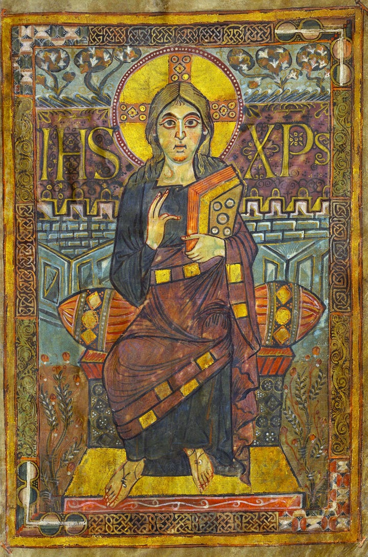

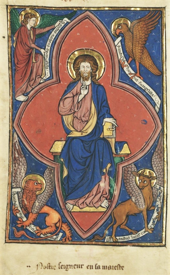
Let’s look at a handy bullet point list of the differences between Gothic and Romanesque painting.
Romanesque Manuscript Elements:
Bold and Vivid Colours: Romanesque manuscripts often use a limited but vibrant colour palette, with strong contrasts. There isn’t a lot of mixing colours or using different shades of the same colour in a single figure. So the colours are the straight, unmixed pigments, fully saturated and not blended, like figures in a colouring book.
Strong Outlines: Figures and elements are outlined with thick, dark lines to emphasize shapes and maintain clarity. The folds of drapery are rendered simply in bold lines and with no modelling or attempt to make them look naturalistic or “3D”.
Little or No Naturalism: Figures are stylized and abstracted. Human and animal figures appear more symbolic than realistic, often with exaggerated features and gestures, rendered in geometric shapes.
Flat Composition: The sense of depth is minimal, with figures and objects arranged in a flat, two-dimensional space. This is shown especially on draperies on human figures that are shown to conform to the shape of the limbs with little natural looking, gravity-directed folds. This is called “damp-fold” drapery, because the impression is that the cloth is damp and sticking closely to the body.
Hierarchical Scaling: Important figures, such as saints or Christ, are often depicted larger than other figures to denote their significance.
Decorative Patterns: Borders and backgrounds may feature intricate, repetitive patterns and motifs.
Lack of Perspective: There is little to no attempt to depict realistic spatial relationships or depth.
Gothic Manuscript Elements:
Naturalistic Colours and Shading: Gothic manuscripts show a broader range of colours and mixes colours to produce more subtle graded shading to create a sense of volume and light.
Delicate Line Work: The outlines are finer and more detailed, contributing to a more refined and elegant appearance. More elegant than bold and exuberant.
Naturalistic and Individualized Figures: Figures are depicted more naturalistically, with attention to human anatomy and individualized and emotionally expressive faces.
Depth Perspective: Attempts to depict three-dimensional space are evident, with early use of linear perspective and overlapping elements to create depth.
Complex Backgrounds: Backgrounds often include architectural elements, landscapes, or detailed scenery that adds context to the scenes.
Dynamic and Graceful Poses: Figures are shown in more dynamic, fluid poses, reflecting a greater understanding of movement and anatomy.
Emotional Expression: Greater attention is paid to the depiction of emotions and narrative interactions between figures, contributing to more engaging and narrative scenes.
Observe the figures: stylized and symbolic figures are typical of Romanesque art, whereas more realistic and individualized figures indicate Gothic style. Look at the composition and background details; flat, pattern-filled backgrounds are Romanesque traits, whereas Gothic illustrations often feature complex, three-dimensional settings with a sense of depth.
Next week’s quiz will be, “Byzantine or Romanesque?”


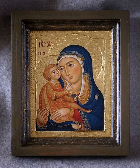
A new-to-me contemporary sacred artist: Irina Obuchowa
The other day I discovered this Polish painter whose work really exemplifies what we’ve been talking about that I thought you’d appreciate seeing…
“The form in an icon is very important and makes it recognizable, but the creator of the icon is the Church, not the iconographer. Hieratic gestures, specific compositional arrangements, abstract backgrounds - these are artistic means that make the icon a place of meeting God in prayer. The icon is, above all, a testimony of the Incarnation of the Son of God.”
I think her work is exceptionally fine. Follow her on Facebook here. And on her website here.
A quick hello to new subscribers and a little update on podcasts to come.
I hope if you’ve enjoyed the free material you’ve found here, and that if you think you might enjoy more in-depth and uplifting stuff, including the podcasts that are coming, you’ll consider taking out a paid subscription. Four months ago, I scrinched up my courage, closed my eyes and held my breath, and took the risk of diving head first and full time into this project and just hoped it would work. And I’m kind of amazed by what a good gamble that was. There’s lots of plans afoot going forward, and the only way to do any of it is with your support:
The Sacred Images Project is a reader-supported publication where we talk about Christian sacred art, the first 1200 years. It’s my full time job, but it’s still not bringing a full time income, so I can’t yet provide all the things I want to and am planning. You can subscribe for free to get one and a half posts a week.
For $9/month you get a weekly paywalled in-depth article on this great sacred patrimony, plus extras like downloadable exclusive images, ebooks, mini-courses, photos, videos and podcasts (in the works).
If you’d like to choose the amount you contribute, you can set up a monthly patronage at my studio blog, Hilary White; Sacred Art here:
Subscribe to join us!

